

In an increasingly data-driven world, numbers and coordinates alone often fail to capture the human element of geographic information. Whether you are an environmental scientist tracking deforestation, a city planner detailing urban development, or a journalist reporting on global migration patterns, the true value of your data lies in how effectively you communicate it. This is where arcgis story maps come into play. Created by Esri, this revolutionary platform has redefined the boundaries of modern cartography, allowing anyone to merge complex spatial data with rich multimedia to craft compelling, immersive narratives.
By leveraging the power of spatial storytelling, users can transform abstract datasets into intuitive, interactive experiences that resonate with audiences on an emotional and intellectual level. In this comprehensive guide, we will explore the depths of this versatile platform, detailing how to utilize its rich feature set, outlining step-by-step creation processes, showcasing inspiring real-world examples, and sharing expert strategies to elevate your digital narrative projects.
Table of Contents
Demystifying ArcGIS Story Maps: What Are They?
At its core, the platform is a web-based builder designed to help users create custom, responsive web pages that center around maps. Unlike traditional static maps that exist as flat images on a page, these narratives are dynamic, allowing readers to zoom, click, pan, and query data layers in real-time. This interactive capability turns passive observers into active explorers.

The tool is a flagship product within the Esri ecosystem, seamlessly integrating with ArcGIS Online and ArcGIS Enterprise. It acts as a bridge between technical geographic information systems (GIS) and mainstream communication. You do not need to be a professional cartographer or a software developer to build a stunning story; the intuitive, block-based builder makes the technology accessible to educators, researchers, non-profits, and corporate entities alike.
While traditional GIS tools focus heavily on data compilation and complex spatial analysis, this platform focuses on presentation and narrative flow. It combines maps with text, photos, videos, and audio tracks, ensuring that the geographic context of your topic is always front and center. By unifying these disparate elements, creators can build seamless, scrollable web stories that look professional on desktops, tablets, and smartphones.
The Power of Spatial Storytelling in the Digital Age
Why does geography make stories more impactful? Humans are inherently spatial creatures. Every event, trend, and historical milestone has occurred somewhere on Earth. When we anchor information to a physical location, our brains process and retain that information more effectively. This is the underlying philosophy of spatial storytelling.
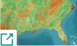
Traditional narrative formats often treat location as an afterthought—a simple mention of a city or country name in a block of text. Map-based narratives, however, elevate geography to a central character. When a reader can see the proximity of a polluted river to a local school, or track the historical retreat of a glacier over fifty years, the message becomes undeniable.
Organizations worldwide are shifting toward digital storytelling tools to convey their messages because static reports and long PDFs are no longer sufficient to capture public attention. Interactive maps provide context that static visuals simply cannot replicate. They allow users to see patterns, understand scale, and comprehend spatial relationships that would otherwise remain hidden in spreadsheets and database tables. By contextualizing complex issues geographically, we foster a deeper, more empathetic understanding of global and local challenges.
Core Features of the ArcGIS StoryMaps Platform
To build a high-impact narrative, you must first understand the building blocks available within the application. Esri has designed a highly flexible workspace that allows for extensive customization. Here are the core features that make the tool so powerful:
1. Immersive Content Blocks
The builder operates on a block-based system, allowing you to insert elements like paragraphs, headings, images, and videos with ease. However, the true magic lies in the immersive blocks:
- Sidecar: A split-screen layout where a media panel (often an interactive map or 3D scene) remains docked on one side while a narrative panel scrolls vertically on the other. This keeps the geographic context visible while the text changes.
- Swipe: An interactive tool that allows readers to drag a slider back and forth to compare two different maps or images. This is exceptionally useful for showing “before and after” scenarios, such as natural disaster damage or urban growth over decades.
- Timeline: A chronological layout that helps structure historical narratives, project milestones, or sequential events alongside spatial data.
- Map Tour: A guided, place-based tour that leads readers through a sequence of points on a map, complete with photos, descriptions, and custom icons.
2. Seamless Multimedia Integration
Modern communication relies on varied media formats. The platform supports robust multimedia integration, enabling you to embed YouTube or Vimeo videos, audio clips, PDFs, and even external web pages directly into your narrative. This ensures your story remains dynamic and engaging, appealing to auditory, visual, and interactive learners alike.
3. Express Maps
Not every story requires complex, pre-existing GIS data. For simpler geographic references, the platform offers “Express Maps.” Within minutes, you can draw points, lines, areas, and add descriptive pop-ups directly inside the story builder. This feature is perfect for marking travel routes, highlighting specific study sites, or indicating simple geographic boundaries without needing advanced GIS software.
4. Custom Themes and Branding
To maintain brand consistency, creators can use the theme builder to customize fonts, background colors, button styles, and link accents. Whether you are aiming for a sleek, corporate look or an organic, nature-inspired design for an environmental campaign, the theme builder provides complete creative control.
Step-by-Step Guide: How to Create an ArcGIS Story Map
Creating your first map-based narrative can seem daunting, but breaking the process down into manageable steps ensures a smooth and successful workflow. Follow this practical guide on how to create an arcgis story map from scratch.
Step 1: Define Your Goal and Audience
Before touching any software, clearly define what you want to achieve. Who is your target audience? What is the core message of your story? What action do you want your readers to take after viewing your narrative? Understanding your audience’s technical literacy and interests will guide your writing style, map complexity, and design choices.
Step 2: Gather Your Assets and GIS Data
A great story relies on high-quality assets. Gather your text, images, videos, and audio files beforehand. More importantly, prepare your geospatial datasets. If you are using custom maps, compile your layer files, style them in ArcGIS Online, and ensure your pop-ups are clean, readable, and free of technical jargon. You can also leverage authoritative data from platforms like the United States Geological Survey to enrich your maps with real-time environmental data.
Step 3: Storyboard Your Narrative
Create a rough outline or storyboard of your narrative flow. Decide where you want to place text, where interactive maps will be most effective, and where immersive elements like Sidecars or Swipes will enhance the user experience. Planning this logical flow in advance prevents structural issues during the building phase.
Step 4: Open the Story Builder and Choose Your Layout
Log into your ArcGIS account and launch the StoryMaps builder. Click “New Story” to start with a blank canvas or choose from several quick-start templates. Begin by adding an eye-catching cover image or video, a compelling title, and a brief subtitle that hooks the reader immediately.
Step 5: Build and Integrate Your Maps
As you scroll down, use the “+” icon to add content blocks. When adding a map, you can select from your own ArcGIS Online web maps, search public maps shared by other organizations, or create an Express Map on the spot. Configure the map’s initial view, toggle layer visibility, and customize the pop-ups so that they display only the most relevant information.
Step 6: Craft the Written Narrative
Write clear, concise, and engaging copy. Break up large blocks of text with headers, bullet points, and pull quotes. Use your writing to guide the reader’s eye to the map, explaining what they should look for and why it matters. Remember to weave your narrative around the spatial visualizations to maintain a cohesive flow.
Step 7: Refine, Preview, and Publish
Once your draft is complete, use the preview mode to see how your story looks on different devices—especially mobile screens, as a significant portion of your audience will likely view it on their phones. Check all links, test interactive map elements, and ensure your spatial data visualization loads quickly. When you are satisfied, click “Publish” and share your story publicly, with your organization, or via social media.
Best Practices for High-Impact Spatial Data Visualization
Designing effective map narratives requires a balance between cartographic science and graphic design. To ensure your project is both beautiful and informative, keep these best practices in mind:
- Prioritize Map Simplicity: Avoid cluttering your maps with too many layers. If you have multiple datasets to show, distribute them across several maps throughout the story rather than cramming them into a single, confusing visual.
- Design for Accessibility: Ensure your text contrast is high, use alt text for images, and choose color palettes that are accessible to colorblind users. Good design is inclusive design.
- Optimize Performance: Large image files and complex map layers can slow down page loading times. Compress your images and optimize your spatial datasets to ensure a seamless scrolling experience for users with slower internet connections.
- Keep Pop-ups Clean: Default GIS pop-ups are often filled with raw database field names and null values. Take the time to format your pop-ups with clear titles, custom text, and relevant attributes to make them user-friendly.
Real-World Inspiration: Best ArcGIS Story Maps Examples
To truly understand the potential of this platform, it is helpful to look at how leading organizations utilize it. Examining the best arcgis story maps examples reveals how diverse industries leverage spatial data to drive change, educate communities, and share histories.
1. Environmental Conservation: Tracking Wildlife Corridors
Conservation groups frequently use map-based narratives to highlight the importance of wildlife corridors. By overlaying animal tracking data onto maps showing human development, these stories visually demonstrate how highways and urban sprawl fragment natural habitats. Readers can interactively follow the paths of individual tracked animals, creating a powerful emotional connection to the conservation cause.
2. Historical Preservation and Education
Cultural institutions, such as the Library of Congress, utilize map-based narratives to bring history to life. By georeferencing historical maps over modern satellite imagery, researchers can guide users through the evolution of cities, battlefields, or trade routes over centuries. This approach provides an immersive learning experience that traditional history textbooks cannot match.
3. Humanitarian and Disaster Response
During natural disasters, humanitarian agencies use real-time mapping to coordinate relief efforts and inform the public. Story maps can combine live weather feeds, demographic data, and shelter locations to show where help is needed most. This quick-deployment capability makes the platform an invaluable tool for crisis communication and resource mobilization.
ArcGIS Story Maps for Education and Research
In academic settings, educators are increasingly turning to arcgis story maps for education to foster spatial thinking and digital literacy. From primary schools to research universities, the platform offers students a unique way to present their research findings.
Instead of writing a traditional term paper, students can synthesize their research into an interactive, public-facing web page. This process teaches valuable skills, including geographical analysis, data visualization, research synthesis, and digital design. For researchers, publishing their findings as a story map ensures their work reaches a broader, non-academic audience, maximizing the real-world impact of their scientific discoveries.
Summary and Next Steps
The ability to tell a compelling story with geographic data is a superpower in the modern information landscape. By combining the analytical depth of GIS with the emotional pull of multimedia journalism, arcgis story maps empower creators to communicate complex spatial realities in a way that is accessible, engaging, and unforgettable.
Whether you are looking to advocate for social change, educate the next generation, or present business analytics to stakeholders, spatial storytelling offers an unparalleled medium for your message. Armed with the step-by-step guidance, best practices, and features outlined in this guide, you are now ready to begin your own cartographic journey. Log into the builder, gather your data, and start shaping your narrative today.