

When working with vast geographical datasets containing thousands of individual coordinates, standard point maps quickly become overwhelming. When points overlap repeatedly, cartographers encounter a common visualization challenge known as overplotting—often referred to as the dreaded ‘spiderweb’ effect. This is where heat maps in arcgis come into play as an essential tool for spatial analysts and GIS professionals.
Heat maps convert dense clusters of point features into a smooth, continuous surface that illustrates relative spatial density. By converting abstract coordinates into intuitively colored gradients—ranging from cool blues and greens for sparse regions to warm oranges and reds for intense concentration—heat maps allow decision-makers to rapidly identify clusters, trends, and anomalies.
In this comprehensive tutorial, we will explore the science, methodology, and practical steps required to produce publication-grade heat maps using both ArcGIS Online and ArcGIS Pro. We will examine the mathematical concepts underpinning kernel density estimation arcgis workflows, discuss essential parameter selection, compare symbology styles against statistical hotspot tools, and highlight real-world applications across diverse industries.
Table of Contents
1. What is a Heat Map in GIS?
In Geographic Information Systems (GIS), a heat map represents the geographical density of point features across a specific geographic expanse. Unlike standard scatter plots or proportional symbol maps, a heat map does not merely display where an event occurred; it calculates and illustrates the localized concentration of occurrences per unit area.
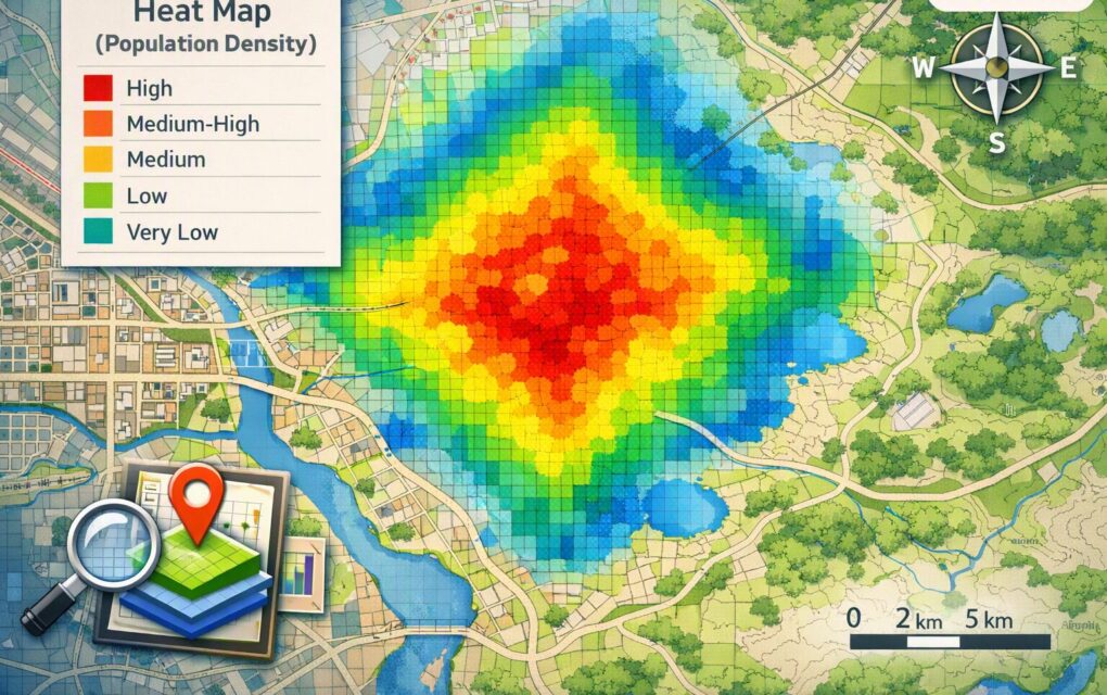
Modern GIS mapping software like ArcGIS offers two distinct mechanisms for constructing spatial heat maps:
- Dynamic Heat Map Symbology: A client-side, real-time visual renderer available in ArcGIS Online and ArcGIS Pro. It calculates point density dynamically on screen based on the display scale and current map view.
- Raster-Based Density Surfaces: A geoprocessing approach utilizing the Spatial Analyst extension (such as the Kernel Density tool) to generate a permanent density surface raster. This raster output assigns an calculated density value to every pixel within a continuous grid, making it suitable for mathematical modeling, map algebra, and downstream spatial overlay analysis.
Using spatial density maps transforms raw spatial coordinates into actionable intelligence. Whether you are analyzing urban traffic collisions, tracking wildlife sightings, or mapping municipal service requests, heat maps serve as the primary bridge between raw data collection and strategic visual communication.
2. Heat Maps vs. Hot Spot Analysis: Understanding the Difference
One of the most frequent points of confusion in spatial analysis is the distinction between a standard visual heat map and a statistically rigorous hot spot analysis. While both techniques highlight areas of concentration, their underlying mathematical foundations and intended analytical outcomes differ significantly.
Understanding hotspot analysis vs heatmap methodologies is critical for avoiding incorrect data interpretations:
- Heat Maps (Kernel Density / Symbology): Visual representations of point density. A high-density area on a heat map simply indicates that many points exist close together within a defined search window. It does not determine whether that concentration is statistically significant or merely the result of random spatial chance.
- Hot Spot Analysis (Getis-Ord Gi* Statistic): A spatial statistics tool available in ArcGIS Pro that evaluates each feature within the context of neighboring features. It yields z-scores and p-values to identify statistically significant spatial clusters of high values (hot spots) or low values (cold spots), comparing the observed distribution against a random spatial distribution.
As illustrated in the comparison above, while simple point density or dynamic heat map symbology provides fast, visually intuitive rendering, spatial statistical techniques like Getis-Ord Gi* provide rigorous statistical confidence. Analysts frequently utilize dynamic dynamic visualization during initial exploratory data analysis before moving into formal statistical modeling.
3. The Science Behind Kernel Density Estimation (KDE)
To construct robust analytical rasters, spatial analysts rely on kernel density estimation arcgis tools. Understanding the spatial algorithms behind these processing operations ensures that your visual outputs accurately reflect real-world phenomena rather than processing artifacts.
The Kernel Function
Mathematically, Kernel Density Estimation fits a smooth curved surface over each input point feature. The surface value is highest at the exact location of the point and diminishes as the distance from the point increases, reaching zero at the outer boundary of a user-defined search radius (also known as the bandwidth).
In ArcGIS, the default kernel calculation is based on the quartic kernel function described by Silverman (1986). The surface density at any given grid cell $x$ is computed using the following equation concept:
Where:
- $r$ is the search radius spatial analysis parameter (bandwidth).
- $d_i$ is the distance between grid cell $x$ and the $i$-th point feature.
- $n$ is the total number of input points within the search distance.
Selecting the Optimal Search Radius (Bandwidth)
The search radius parameter is the single most influential setting in density mapping. Adjusting the bandwidth alters how spatial point pattern analysis generalizes the underlying data:
- Small Bandwidth: Retains localized spatial detail, capturing sharp, micro-scale spikes in density. However, if set too small, it can produce a fragmented map showing disjointed rings around isolated points.
- Large Bandwidth: Smooths out local variations, emphasizing broad, regional spatial trends. However, an excessively large search radius risks oversmoothing, obscuring key local hotspots and creating misleading visual blobs.
Population and Weighting Fields
ArcGIS allows analysts to assign a weight field (Population Field) during density calculations. Instead of treating every point as a single occurrence of value 1, the point can be weighted by a numeric attribute—such as financial transaction amounts, crime severity indexes, or patient count. This transforms a simple frequency surface into an attribute-weighted density surface.
For spatial analysts seeking authoritative guidelines on geographic data standards, consulting resources provided by the U.S. Geological Survey (USGS) offers invaluable context on cartographic scale and accuracy specifications.
4. How to Create Dynamic Heat Maps in ArcGIS Online
For quick web-based visualization, Esri’s ArcGIS Online Map Viewer provides an intuitive dynamic renderer. If your goal is to publish interactive web apps or dashboard cards without performing complex spatial analyst license operations, dynamic visual styles are ideal.
Here is how dynamic heat maps in arcgis online are configured:
Step 1: Prepare and Upload Your Point Data
- Sign in to your ArcGIS Online organization account.
- Navigate to Map Viewer.
- Click Add > Add Layer from file (or select a hosted feature layer containing point geometry, such as CSV, GeoJSON, or Feature Service).
Step 2: Change Symbol Style to Heat Map
- In the right-hand tool panel, open the Styles (Smart Mapping) pane.
- Under Choose an attribute, select Show location only (or select a numeric attribute if you wish to weight the heat map).
- In the list of available drawing styles, select Heat Map and click Style Options.
Step 3: Configure Area of Influence and Color Ramps
- Area of Influence (Radius): Drag the slider to adjust the spatial blur radius. Notice how the canvas updates live as you modify the radius.
- Color Ramp Select: Choose a high-contrast color palette. For light basemaps, a ramp transitioning from transparent yellow to deep purple/red works exceptionally well. For dark canvas basemaps, bright neon ramps (cyan to yellow/white) maximize visual clarity.
- Zoom-Dependent Density: Check the option to adapt density to zoom level. As users zoom in or out, ArcGIS Online dynamically recalculates the screen-space search radius so density rendering remains cartographically balanced at all scale levels.
- Click Done and Save your web map.
5. How to Create a Heatmap in ArcGIS Pro Step by Step
When producing static map layouts for formal reports or generating permanent spatial rasters for mathematical modeling, ArcGIS Pro is the industry standard. Below is a detailed walkthrough explaining how to create a heatmap in arcgis pro step by step using both basic display symbology and advanced Spatial Analyst tools.
Method A: ArcGIS Pro Heat Map Symbology (Dynamic Display)
This method updates dynamically as you navigate the layout view and requires no additional license extensions.
- Open your project in ArcGIS Pro and add your point feature class to the Contents pane.
- Select the layer, navigate to the Feature Layer contextual tab on the top ribbon, and click Symbology.
- In the Symbology pane drop-down menu, change the renderer from Single Symbol to Heat Map.
- Set the Method to either Constant (maintains a fixed geographic radius regardless of scale) or Dynamic (adjusts radius as you zoom in and out).
- Adjust the Radius slider (measured in points or map units).
- Select a suitable Color Scheme and set transparency values if overlaying on top of topographic basemaps.
[ArcGIS Pro Symbology Pane]
  ├── Primary Symbology: Heat Map
  ├── Weight Field: <None or Attribute_Value>
  ├── Method: Dynamic (Scale-dependent)
  └── Radius: 25 pts
Method B: Spatial Analyst Kernel Density Tool (Permanent Raster Output)
To conduct quantitative spatial point pattern analysis or map algebra, you must generate an explicit raster dataset using geoprocessing tools.
Step 1: Open the Geoprocessing Tool
Ensure that your ArcGIS Spatial Analyst extension is enabled (Navigate to Project > Licensing > Configure your licensing options). Open the Geoprocessing pane (Analysis tab > Tools) and search for Kernel Density.
Step 2: Configure Essential Parameters
To achieve the best settings for arcgis kernel density heat maps, set your parameters systematically:
- Input point or polyline features: Select your target point dataset (e.g.,
City_Incidents_2026). - Population field: Choose
NONEfor raw event count density, or select a numerical attribute column to apply feature weighting. - Output raster: Specify a geographic path and filename within your project File Geodatabase (e.g.,
C:\GIS_Projects\Output.gdb\Crime_KDE_Density). - Output cell size: Define the resolution of your output grid pixels. Smaller cell sizes produce smoother visual rasters but increase file size and processing times. A rule of thumb is to set cell size to $1/250$th of the shorter extent boundary of your study area.
- Search radius (Bandwidth): Enter a specific numeric distance in linear projection units (e.g., Meters or Feet). Leaving this blank causes ArcGIS Pro to calculate a default bandwidth based on Silverman’s Rule of Thumb, which prevents extreme data clustering but may oversmooth local micro-clusters.
- Area units: Select desired density output units, such as Square Kilometers or Square Miles.
- Method: Choose Planar for local projected coordinate systems or Geodesic for global/unprojected coordinate systems spanning large distances.
Step 3: Execute and Apply Raster Symbology
- Click Run to generate the output raster heat maps GIS surface.
- Right-click the newly generated raster layer in the Contents pane and select Symbology.
- Change the render type to Classified (to group continuous density values into distinct quantile or natural breaks bins) or Stretched (for continuous color transitions).
- Apply a Gamma Stretch or custom color ramp to highlight subtle density variations in lower ranges.
For technical references on geodesic spatial metrics and projection algorithms, refer to official documentation hosted at Esri ArcGIS Documentation.
6. Real-World Applications Across Industries
Density surface mapping is utilized across a wide spectrum of scientific, commercial, and governmental domains to uncover latent spatial patterns.
Crime and Public Safety
Law enforcement agencies rely heavily on density mapping to identify high-crime corridors and optimize police patrol routes. By processing historical dispatch records through kernel density tools, analysts generate operational maps displaying emerging crime spikes, enabling proactive resource deployment.
Urban Planning and Intelligent Transportation
Municipal planners utilize spatial density mapping to analyze traffic collision occurrences, pedestrian foot traffic patterns, and public transit utilization. Overlaying crash density rasters onto infrastructure maps helps civil engineers identify hazardous intersections requiring safety redesigns.
Environmental Science and Ecology
Ecologists apply search radius spatial analysis to track animal migrations, deforestation hotspots, and invasive species spread. For instance, wildlife researchers calculate home ranges by constructing kernel density estimates from GPS collar telemetry coordinates. Epidemiological research programs supported by entities like the Centers for Disease Control and Prevention (CDC) frequently leverage density mapping to map vector-borne disease outbreaks.
Retail Site Selection and Real Estate
Commercial real estate developers utilize spatial density surfaces to evaluate potential retail locations. By calculating customer location density alongside competitor placement, businesses can identify underserved markets and forecast potential store sales.
7. Common Pitfalls and Best Practices
While creating a heat map in ArcGIS is technically straightforward, generating cartographically accurate and analytical sound heat maps requires adherence to key best practices.
1. The Bandwidth Bias Trap
The single most critical error in density mapping is selecting an inappropriate search radius. If your bandwidth is too broad, every urban center will look like an identical uniform blob, hiding localized variance. Conversely, if your bandwidth is too narrow, your map will resemble a point map with glowing halos around individual points.
- Best Practice: Perform sensitivity testing by generating multiple rasters at varying search distances (e.g., 250m, 500m, 1000m) to evaluate how scale impacts spatial interpretation.
2. Map Projection Selection
Kernel calculations rely directly on distance measurements ($d_i$). Executing planar density calculations while using an unprojected Geographic Coordinate System (such as WGS 84 in decimal degrees) causes spatial distortion, especially at higher latitudes.
- Best Practice: Always project your input point dataset into an appropriate local Equal Area or Conformal Projected Coordinate System (e.g., State Plane or UTM) prior to running raster geoprocessing tools.
3. Normalization and Population Context
Mapping raw point counts can create misleading results. For example, plotting raw emergency calls will inevitably mirror population density—metropolitan areas will always appear ‘hot’ simply because more people live there.
- Best Practice: Normalize your input data whenever possible. Instead of mapping raw incident counts, calculate density per 1,000 residents or per total vehicle miles traveled to reveal genuine risk levels.
4. Color Palette Selection for Accessibility
Color choice fundamentally shapes how readers perceive risk and density. Avoid non-standard rainbow color scales that lack natural visual hierarchy.
- Best Practice: Utilize single-hue gradients (e.g., light yellow to dark brown) or intuitive sequential multi-hue palettes (e.g., yellow to orange to dark red). Ensure sufficient contrast for colorblind accessibility by checking palettes against color-vision-deficiency standards published in geographic research journals like Nature Scientific Reports Spatial Analysis.
8. Summary Checklist for GIS Analysts
Before publishing your spatial density analysis layout, use this rapid checklist to ensure cartographic excellence:
- [ ] Coordinate System: Is the feature class in an appropriate local Projected Coordinate System?
- [ ] Tool Selection: Did you choose dynamic display symbology (for quick web interaction) or Kernel Density geoprocessing (for analytical modeling)?
- [ ] Bandwidth Justification: Is the chosen search radius defended by empirical domain knowledge or rigorous sensitivity testing?
- [ ] Weighting: Has a population field been correctly applied if points represent varying magnitudes?
- [ ] Legend & Basemap: Does the layout include a clear legend explaining density units (e.g., Points per Sq Km), and is the basemap neutral enough not to compete with the visual overlay?
Conclusion
Mastering heat maps in arcgis equips spatial analysts with a powerful capability: turning complex, overlapping point datasets into clear, visually captivating, and decision-ready geographical insights. Whether you leverage the quick smart-mapping capabilities of ArcGIS Online or execute advanced spatial point pattern analysis using the Kernel Density tool in ArcGIS Pro, spatial density surfaces remain a fundamental technique in modern geographic data science.
By carefully selecting projection systems, refining search bandwidths, avoiding normalization pitfalls, and applying clean cartographic design principles, you ensure that your spatial maps provide genuine value to your organization. Step beyond basic point plotting, explore the density tools in your ArcGIS toolkit, and unlock the hidden spatial narratives buried within your spatial data.